MP4 | Video: h264, 1280x720 | Audio: AAC, 44.1 KHz, 2 Ch
Genre: eLearning | Language: English + srt | Duration: 10 lectures (2h 1m) | Size: 1.77 GB
Making different plots like Barplot, Scatterplot etc.
Get a kick start on exploratory data analysis using plotly library
Exploratory data analysis using plotly library
Visualizing data through graphs
Using different functions to make the graph look more accurate
Applying conditions to the dataset
Basic knowledge of python programming language
Welcome to the Plotly library Tips exploratory data analysis course! An excellent choice for bners and professionals looking to expand their knowledge on one of the most popular Python libraries in the world i.e plotly library. This course includes case study for drawing meaningful insights out of given data.
Plotly library Tips exploratory data analysis course offers video tutorials on the most powerful data analysis toolkit available today.
Why learn Data Analysis and Insights Visualization using Python
If you've spent in a spreadsheet software like Microsoft Excel, Google Sheets or any form of tabular data such as database tables, delimited files or csv files and are eager to take your data analysis skills to the next level using python, this course is for you!
Plotly Python Open Source Graphing Library
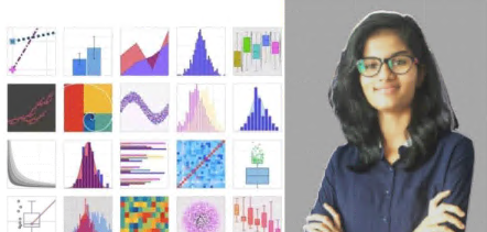
Plotly's Python graphing library makes interactive, publication-quality graphs. Examples of how to make line plots, scatter plots, area charts, bar charts, error bars, box plots, histograms, heatmaps, subplots, multiple-axes, polar charts, and bubble charts.
The Plotly Python library is an interactive open-source library. This can be a very helpful tool for data visualization and understanding the data simply and easily. plotly graph objects are a high-level interface to plotly which are easy to use. It can plot various types of graphs and charts like scatter plots, line charts, bar charts, box plots, histograms, pie charts, etc.
So you all must be wondering why plotly over other visualization tools or libraries Here's the answer -
Plotly has hover tool capabilities that allow us to detect any outliers or anomalies in a large number of data points.
It is visually attractive that can be accepted by a wide range of audiences.
It allows us for the endless customization of our graphs that makes our plot more meaningful and understandable for others.
So in this course you will get to learn visualization using the plotly library
Data Science enthusiasts interested in learning exploratory data analysis using library
DOWNLOAD
uploadgig.com
https://uploadgig.com/file/download/25e19db84c0e83eb/Plotly_library_Tips.part1.rary_Tips.part1.rar
https://uploadgig.com/file/download/49D2c1a3A6830035/Plotly_library_Tips.part2.rary_Tips.part2.rar
rapidgator.net
https://rapidgator.net/file/ac4b5d93d746e5bbfcf20ed4c69ef190/Plotly_library_Tips.part1.rar.htmly_Tips.part1.rar
https://rapidgator.net/file/a16c311b4775b1e9df7308477d10c733/Plotly_library_Tips.part2.rar.htmly_Tips.part2.rar
nitro.download
https://nitro.download/view/3202735310D89AB/Plotly_library_Tips.part1.rary_Tips.part1.rar
https://nitro.download/view/AEAA2FC3DD1F09E/Plotly_library_Tips.part2.rary_Tips.part2.rar